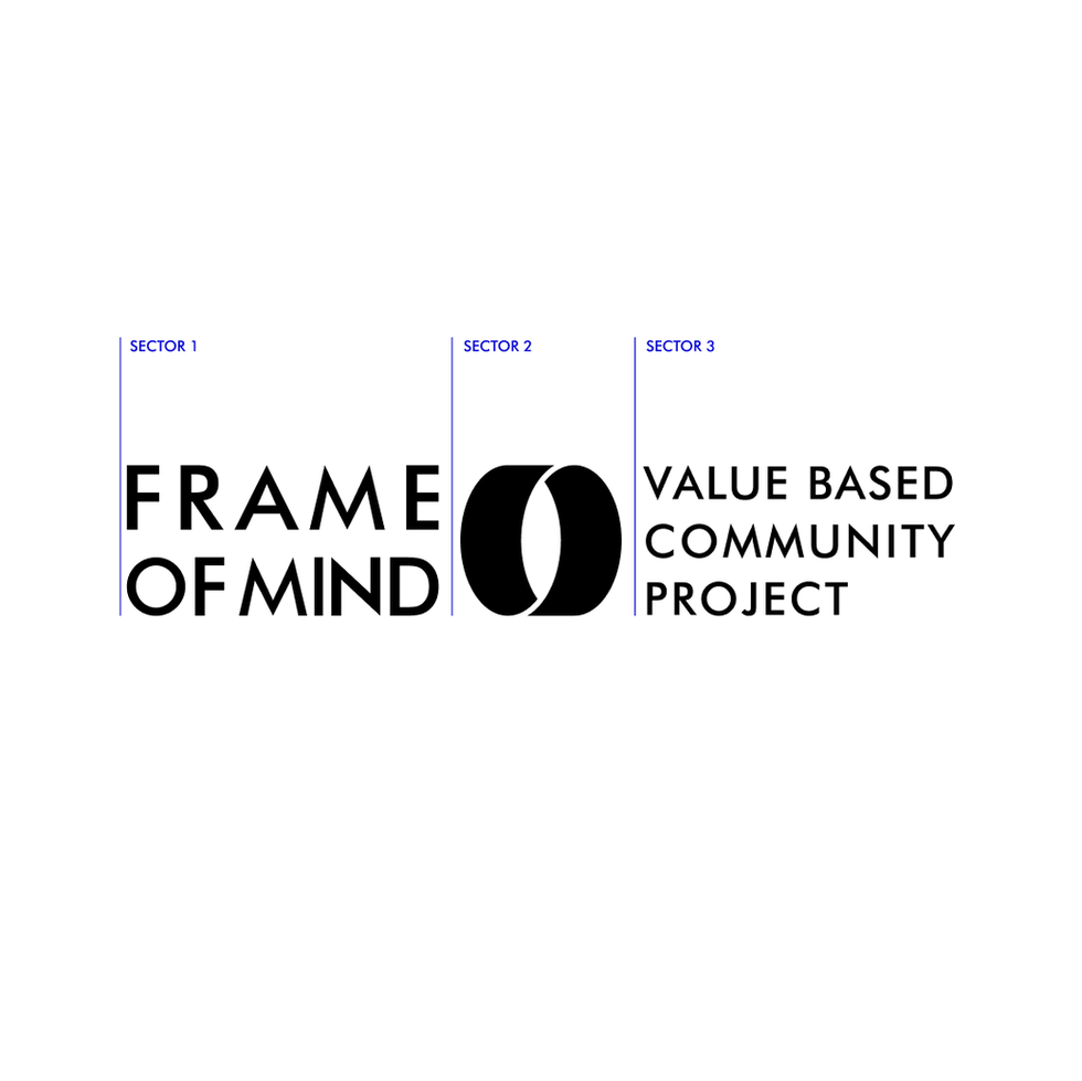
FOM Logo
03 Master Brand Logo
FOM’s logo is the key identifier of the project.
This section provides details on available logos and intended usage.
Our logo represents the essence of our project, FRAME OF MIND.
It symbolizes the tunnel, the path to new perspectives and ideas. It embodies the spirit of exploration and discovery.
The vertical eye shape in the center signifies the power of perception, the ability to see things from a different angle.
The two bodies which integrates in harmony that represent the infinite possibilities that arise from joining opposite forces. The logo reflects our passion for creativity, our commitment to diversity and inclusivity, and our belief in the transformative power of the human mind.
Logo Philosophy
Our Wordmark can be used without our symbol.
Wordmark

As a preference the primary logo is in black & white. Whereas the full color positive is available to use in both FOM (Blue) and FOM (Navy Blue).
Primary logo

The FRAME OF MIND is comprised of two essential elements, and one optional, the logo, the Wordmarks and the tagline, which can be presented in different formats:
-
Primary icon only
-
Primary icon with English Wordmark
-
Primary icon with Arabic Wordmark
-
Primary icon with both English & Arabic Wordmark
-
Primary icon with English Wordmark & tagline
-
Primary icon with Arabic Wordmark & tagline
But caution should be exercised to ensure viewers are either:
-
Aware they are engaging with a FOM communication or
-
Familiar with the logo and brand
In all other instances the full Wordmark should be preferenced.
Logo Suite

A suite of alternate logos and lock-ups have been created to provide flexibility when designing to specific formats and mediums.
Logo and lock-up suite


The logo has been carefully crafted to read well, even in small sizes. There is no limit at large scale, but be careful at smaller sizes. Follow the minimum size requirements (outlined below) when using the logo at small scales.
Scale
Print minimum size
H 6mm
Digital minimum size
H 16px
Print minimum size
H 6mm
Digital minimum size
H 16px
Print minimum size
H 8mm
Digital minimum size
H 24px

The exclusion zone ensures the legibility and impact of the logo by isolating it from competing visual elements such as text, graphics and imagery. The diagrams show the correct amount of space that should surround the logo. No accompanying text or logos should appear in this area.
Exclusion zones

Logo on background

As a preference the primary logo is in black & white. Whereas the full color positive is available to use in both FOM (Blue) and FOM (Navy Blue).

Inverted master brand logo complete suite


